

Glamourous Magazine Story Layouts
 Even though Glamour is a fashion magazine, I found that the publication as a whole is professionally designed and executed. The story layouts are original, meticulous and attractive. I noted that the individuals who designed the "Buffer Boy" article made certain to align words and paragraphs, to standardize the margin space, and to add other alluring elements such as boxes and pictures to draw the reader’s attention. All of the text on the page is legible and the pink accentuations are consistent throughout the page.
 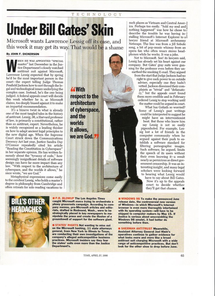 I found another excellent example of a story layout in Time magazine. "Under Bill Gates' Skin" caught my attention because of the stark, uncluttered layout of the page. The primary story dominates the space and the accompanying picture is neither distractive nor boring. Like “Buffer Boy” in Glamour, the text box adds interest to the page without drawing the reader’s attention away from the main story. The red text also works to the advantage of this article by highlighting certain points of interest.
posted by Jolie Duhon @ 11:53 AM
![]()
![]()
0 Comments:
Post a Comment
<< Home