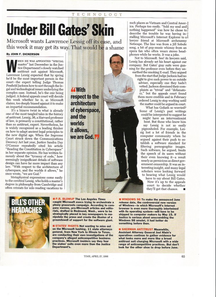
Monday, December 05, 2005

Veni, Vidi, Vici!

Veni, Vidi, Vici. I came, I saw, I conquered. This semester started out as a challenge, but I rose to the occasion, learned as much as I could and walked away feeling successful. My primary goal for Visual Communication, MC 2015, was to produce work throughout the semester that would reflect my experience with and knowledge of different design-creating programs, thus enticing future employers to consider me above other applicants. I feel that my final product for every one of the projects assigned in this class was a step above and beyond the previous work that I had created.

army cat pictureFor instance I have worked with Adobe Photoshop for two years, but it was not until this semester that I learned how to manipulate two or more photographs and fuse them into one, creating an interesting image such as the Army Cat.

I also learned a lot about Adobe InDesign and, after working with the program for a few class periods, I was able to create a client-based newsletter for LEGO.

LEGO Life newsletter-page 2LEGO Life newsletter-page 1I am both proud of and excited about the products that I created through my exploration of new programs and techniques, and I know that this class has taught me the skills necessary to work for large fashion magazine such as Glamour.

Monday, November 07, 2005

Glamourous Magazine Story Layouts

Even though Glamour is a fashion magazine, I found that the publication as a whole is professionally designed and executed. The story layouts are original, meticulous and attractive. I noted that the individuals who designed the "Buffer Boy" article made certain to align words and paragraphs, to standardize the margin space, and to add other alluring elements such as boxes and pictures to draw the reader’s attention. All of the text on the page is legible and the pink accentuations are consistent throughout the page.

I found another excellent example of a story layout in Time magazine. "Under Bill Gates' Skin" caught my attention because of the stark, uncluttered layout of the page. The primary story dominates the space and the accompanying picture is neither distractive nor boring. Like “Buffer Boy” in Glamour, the text box adds interest to the page without drawing the reader’s attention away from the main story. The red text also works to the advantage of this article by highlighting certain points of interest.

Monday, September 19, 2005

Good and Bad Web Sites to Discuss

After searching online for nearly two hours, I found two excellent Web sites that I would like to share with the class. The first site, http://www.pinarello.com/eng/about_dealers_italy.php, an online gallery for the Italian bicycle manufacturer Pinarello, is catchy and easy to understand. It exemplifies two of the important principles of creating a good site: repetition and contrast. The graphics at the top of each page are the same and the color of the text contrasts nicely with other colors in the site. The second site that I am impressed with is the Web site for Jelly Belly jelly beans, http://jellybelly.com/Cultures/en-US. This site is simple and aligned properly. I found that there were not many examples of sites that were consistently aligned.

In my quest to find decent Web sites, I also found many sites that were horrendous. Http://www.pets4you.com/, an informational Web site for pet owners, was disorganized, misaligned and cluttered with advertisements. Some of the text was aligned center and some was aligned left. Another Web site that is hard to follow is the online edition of Conspiracy Digest, http://www.conspiracydigest.com/. The graphic at the top of each page never aligns with the rest of the text, and there is no repetition for clarity.

The assigned readings for class gave me a better idea of the elements that make a Web page eye catching, easy to follow and interesting. I better realize that many sites are sloppy and disorganized, but with a little work, could look exponentially better.

Wednesday, August 24, 2005

Lofty Goals for Class and Life

This semester, although it has only begun, has already proved to be a challenge. Have no doubt, however, that I am up to the challenge! I feel that many of my classes this semester, especially 2015, will help me in future endeavors. My long-term goal is to take photographs for a large fashion magazine, perhaps Vogue or Glamour, and I think that this class will be tremendously helpful in preparing me for that task. I am extremely interested in the way that taking a striking photograph and writing a captivating column work together to communicate to the masses, and I can't wait to share my excitement with the rest of the class!